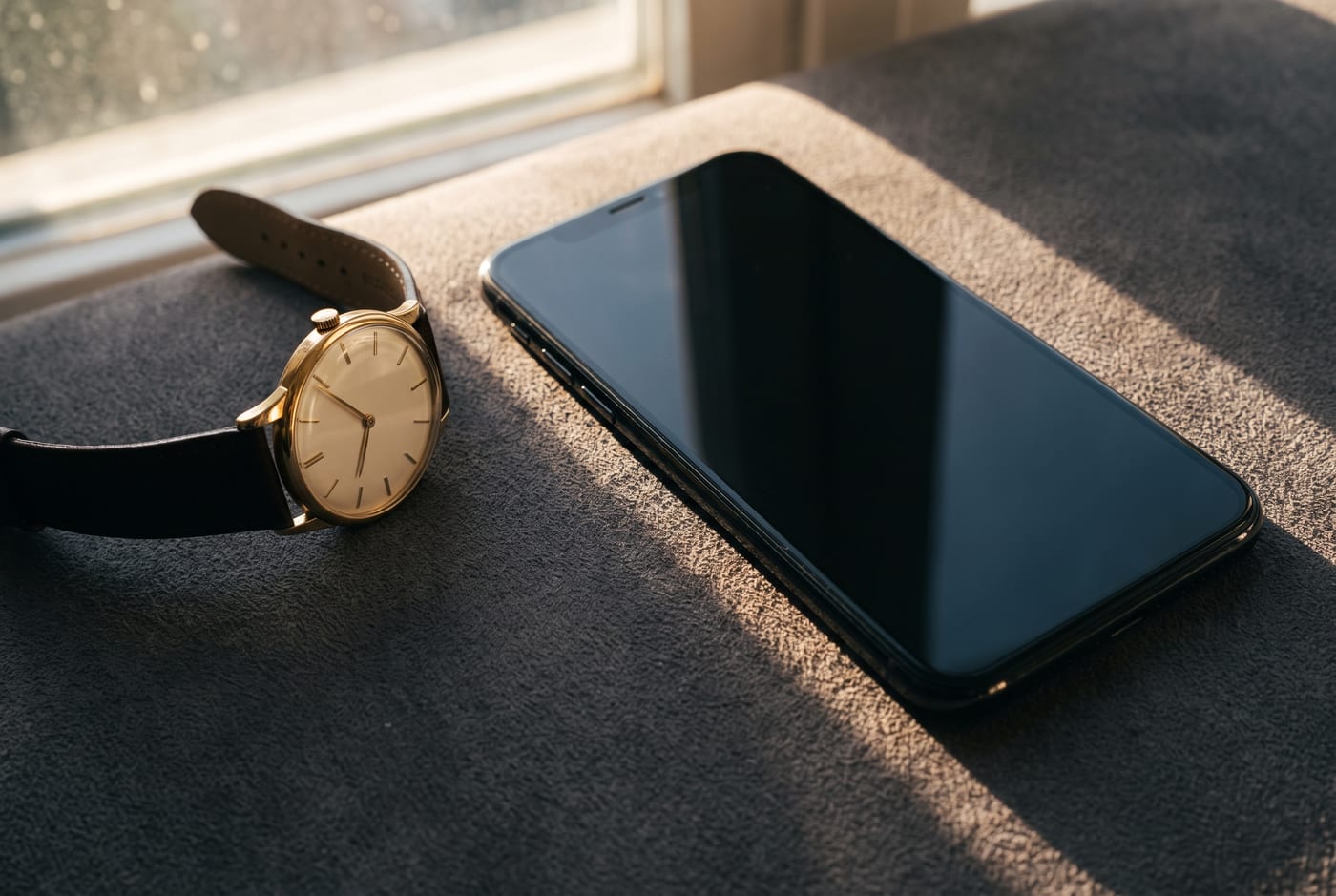
Nobody decided that the Lock Screen would become the most-looked-at designed surface in human life. It just happened, glance by glance. The average person checks their phone somewhere between eighty and a hundred and fifty times a day, and most of those checks never get past the first screen — a flick of the wrist or a tap on the nightstand, two seconds of reading, done. Time, a notification or two, maybe the weather. That gesture, repeated a hundred times a day, is not app use. It's something much older wearing new glass. It's checking your watch.
The lineage is almost too neat. The pocket watch put the time on your person; the wristwatch, after the trenches of the First World War made digging into a pocket impractical, put it at a glance. For a century the watch face was the most personal square inch of design most people owned — chosen carefully, worn daily, read constantly, and understood by everyone as a statement. Then the phone arrived and, for a while, killed the watch outright. A generation simply stopped wearing one. But the glance didn't die. The glance is apparently a human constant, some small recurring need to locate yourself in the day. It just needed somewhere to land. It landed on the Lock Screen.
The face returns
For years the Lock Screen didn't deserve the traffic. It was a gate: your photo, a clock in a font you didn't choose, a pile of notifications. Then iOS 16 quietly performed one of the more interesting reversals in software design — it turned the gate into a face. Suddenly the clock had selectable typefaces and colors. Widgets appeared, small complications in all but name. Depth effect let a photo's subject lean in front of the digits, giving a flat screen the layered depth of a good chronograph dial. The vocabulary Apple used internally was borrowed from watchmaking, and it showed: faces, complications, styles. The Apple Watch had taught them how people relate to a glanced-at surface, and the Lock Screen inherited the lesson.
What makes the comparison more than cute is the density of the relationship. A hundred glances a day is thirty-six thousand a year. No painting you own, no photograph on your wall, no object in your house comes close to that viewing count. Whatever occupies that surface gets seen more than your own front door. Which is why it feels genuinely wrong when it's neglected — the default wallpaper, the clock color fighting the photo, a screenshot you meant to deal with in March. A neglected Lock Screen is like a stopped watch you keep consulting anyway. It works, technically. It just answers every glance with a shrug.
Reading the dial
And like the watch, it signals — inward more than outward. A wristwatch was always partly for other people; the Lock Screen's audience is almost entirely you, plus the occasional stranger when your phone lights up on a café table. That inversion is what makes it the most personal square inch you own rather than the most public. The runner with a widget row of rings and sunrise times, the parent whose depth-effect subject is a four-year-old leaning in front of the clock, the minimalist running thin white digits over near-black — each has built, mostly without thinking of it this way, a watch face for their own life. When members here coordinate a wallpaper from a new drop with a case colorway and a matching clock tint, they're doing what watch people have always done with straps and dials. Same instinct, bigger crystal.
There's also a case for taking the glance itself seriously. Two seconds, a hundred times a day, adds up to a few minutes daily spent looking at this one composition — but its real weight is positional: it's the first thing you see when you reach for the phone with intent, and the thing that decides whether a reach becomes a scroll. A Lock Screen with only what you need — time, weather, the day's next fixed point — answers the glance and lets you put the phone down. One crowded with lures does what a slot machine does with the same two seconds. The watch never had this problem. The watch only ever told you the time and let you go. That restraint turns out to be a design feature, and it's available as a choice.
The wristwatch survived, of course — some of it as jewelry, some of it as fitness equipment. But its old job, the ambient, unconscious, hundred-times-a-day locating of yourself in time, has fully migrated to the glass in your pocket. That square inch is yours now, more customizable than any dial ever was and more looked-at than anything you own. It seems only fair to compose it like it matters. By glance count alone, nothing you own matters more.