A wallpaper collection looks, from the outside, like the easiest thing in the world to make. Find twenty beautiful images, export, done. And if a wallpaper were merely a picture, that would be the whole job. But a wallpaper is not a picture. It's a picture that has to live underneath a clock, behind a grid of icons, around a camera cutout, on six different screen shapes, in light mode and dark, at seven in the morning when its owner is not feeling generous. It is less like publishing a photograph and more like tailoring a garment: the fabric matters, but the cut is the work.
Every drop in the member library goes through the same quiet gauntlet before it ships. This is what that actually involves — partly because members ask, and partly because once you know how a wallpaper is made, you start seeing every screen differently.
Theme before pixels
A drop starts as a sentence, not an image. Something like: the hour after sunset in a city you don't live in. Or: what carbon fiber would dream about. The sentence matters because a collection is a promise of coherence — twenty images that feel like rooms in one house, not twenty strangers in an elevator. Without the sentence, you get a folder of nice pictures that fight each other. With it, every candidate image can be interrogated: does this belong to the sentence or not? Most don't. A finished drop of twenty usually means sixty or eighty candidates went in the bin, some of them genuinely lovely. Lovely is not the bar. Belonging is.
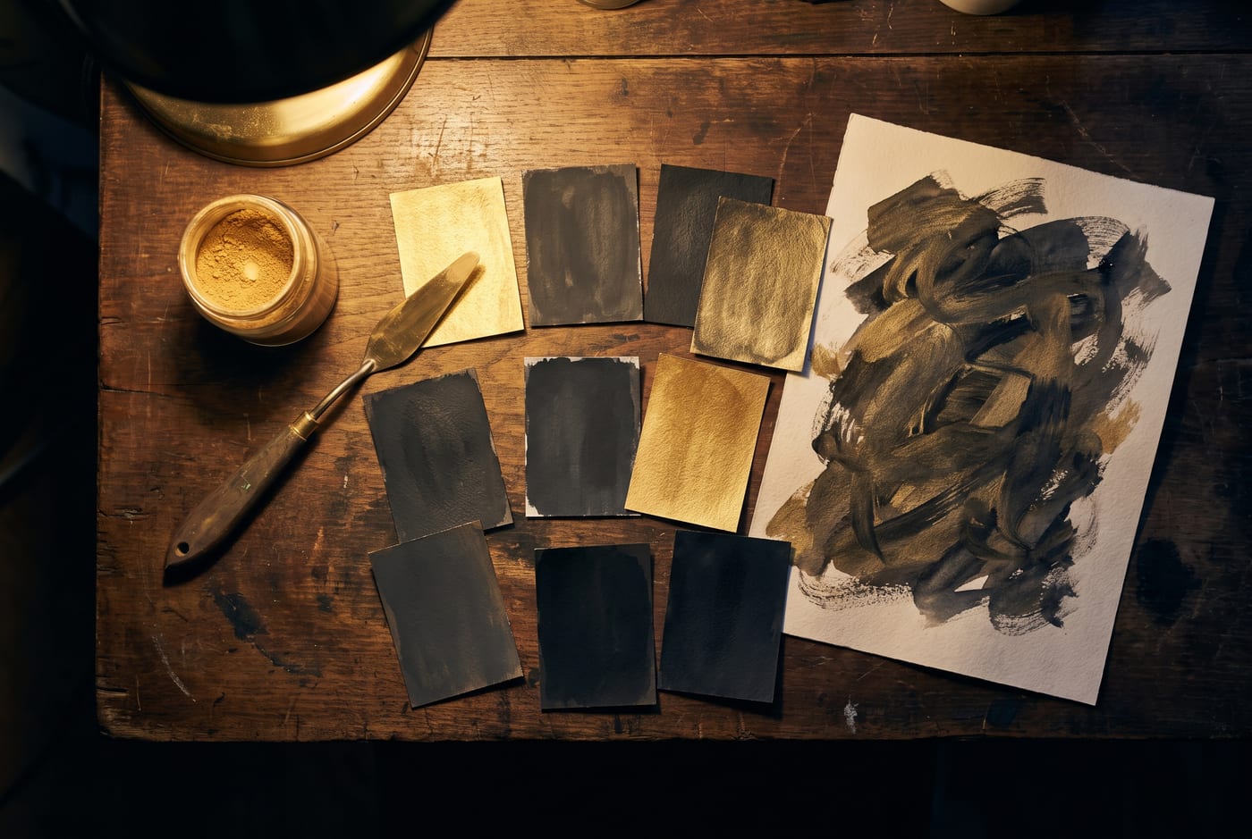
Then comes palette, and palette is where discipline earns its keep. Each collection is built around a small family of colors — an anchor, one or two accents, and a defined dark end — chosen partly for beauty and partly for what they'll sit next to. A wallpaper is never viewed alone; it's viewed under white or black clock digits, behind icons, beside a case. The palettes are deliberately tuned to pair with case colorways, which is why a drop tends to arrive rhyming with the season's shells. That's not marketing choreography so much as the same sentence being answered twice, once in fabric and once in light.
The tyranny of the clock
Here is the constraint that shapes everything: the iOS Lock Screen clock lives in the upper portion of the screen, it is enormous, and it is not moving. Whatever we make must either yield to it or converse with it. This kills more compositions than any aesthetic judgment does. A gorgeous image with its subject in the upper third is, as a Lock Screen, a gorgeous image with a time stamp through its face. So every composition is built clock-safe from the start: visual mass pushed low or to the edges, quiet zones held open where the digits and widgets will sit, contrast in the clock region controlled so the time stays legible over it in both white and black text.
The fun exception is depth effect — the iOS trick where a subject can overlap the bottom of the clock, sliding in front of the digits like a figure stepping past a neon sign. When a drop includes depth-effect pieces, those are composed twice as carefully: the subject has to break the clock's lower edge by enough to feel intentional and not so much that the time becomes a guess. Get it right and the screen gains an almost physical layering. Get it wrong and it looks like an accident. There is no middle.
- Visual weight kept low and lateral, leaving the clock's air uncontested
- Contrast in the upper region tested against both white and black digits
- Focal points checked against the widget row and the flashlight and camera controls
- Depth-effect subjects tuned to overlap the digits without swallowing them
Cut to fit
Then the tailoring proper: device-exact renders. A composition that sings on a 6.9-inch Pro Max can clip badly on a smaller screen — aspect ratios differ, safe zones shift, the Dynamic Island sits at a different proportional height. So nothing ships as one file scaled to fit. Each piece is re-framed per device class, checked at actual size, and pushed through the least glamorous step of all: setting it on real hardware and staring at it. On the Lock Screen, with real notifications piling on top. Behind the Home Screen grid, blurred and unblurred. In sunlight, if the week allows. A surprising number of finalists die here, in the last mile, for sins invisible in the editor — a hot spot that fights the battery icon, a texture that shimmers behind icons like static.
What survives is the drop: usually twenty pieces from a field of four times that many, each one carrying its rejections invisibly inside it. Members see a themed collection appear in the library with a name and a palette. What actually arrived is a set of small garments, cut for your exact screen, pre-argued-with, tested against the one roommate — that clock — none of us gets to evict. The next time a wallpaper simply feels right and you can't say why, the honest answer is: because somewhere, earlier, sixty others didn't.